Intranet UX & Web Design
NWMA Connect Redesign
Redesigning the NWMA Connect SharePoint intranet for the Department of Justice and Community Safety, so staff across multiple business units can find information, tools and resources faster.
- Role
- Digital Experience Officer
- Client
- DJCS, Victoria
- Year
- 2026
- Platform
- SharePoint
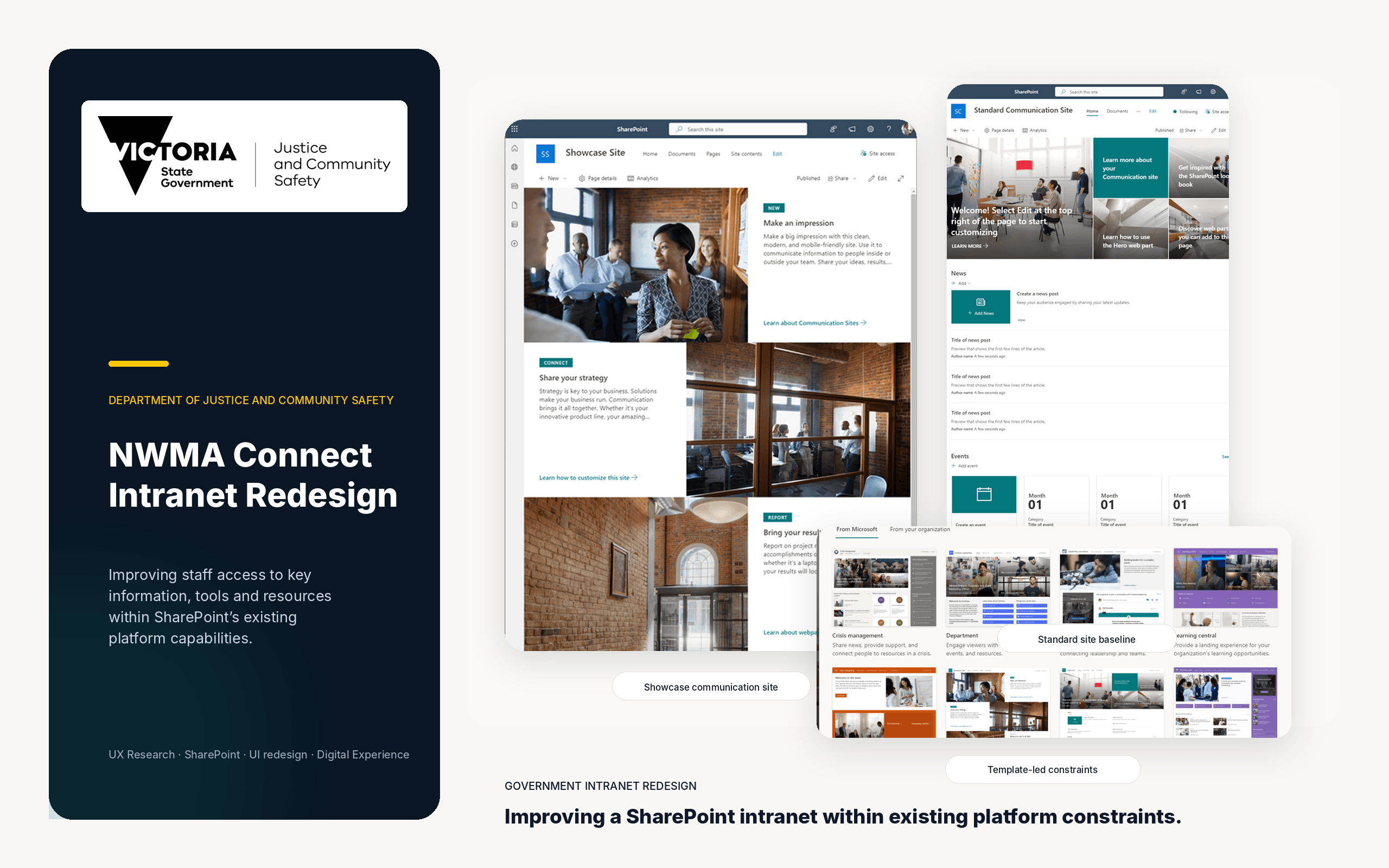
Due to the confidential nature of this government project, some visuals, details and links have been omitted or anonymised.
Project overview
NWMA Connect is a SharePoint communication site used by staff within the North West Metropolitan Area of the Department of Justice and Community Safety. The platform brings together regional news, business unit information, staff recognition, leadership content, wellbeing resources and links to commonly used internal systems. The redesign focused on improving the experience within SharePoint's existing platform capabilities rather than rebuilding the site from scratch.
Challenges
The site had expanded over time without a consistent content or design structure. Pages were often dense, layouts varied between sections and important information competed with secondary content.
Navigation labels were not always clear, commonly used resources were spread across different areas and inconsistent imagery, spacing and page patterns made the experience feel fragmented.
Business needs
Staff needed a clearer and more predictable way to find regional updates, operational information, contacts and frequently used tools. Business units also needed pages that represented their services accurately while remaining practical for non-technical content owners to maintain. The redesign therefore had to balance staff usability, business ownership, content accuracy and long-term maintainability.
Information architecture
Content was reorganised around the tasks staff were most likely to complete: finding important updates, accessing tools, locating business unit information and identifying the right contacts or support services. Related content was grouped into clearly labelled sections, while long or dense pages were broken into smaller, scannable content blocks. This reduced information overload and created a more logical reading order from high-priority information to supporting detail.
Navigation strategy
The navigation was simplified to help staff reach important information with fewer steps. The site header was refined so the logo, site title and main navigation links were clearer and did not compete for space. Common destinations were grouped under straightforward labels, while frequently used tools and resources were brought onto the homepage and relevant business unit pages through clearly presented Quick Links. This reduced unnecessary searching, improved wayfinding and made the site easier to use for both regular and first-time visitors.
SharePoint redesign
The homepage was redesigned to establish a clearer hierarchy: a recognisable site header, a concise purpose statement, featured content, news and monthly updates, followed by quick access to tools and resources. SharePoint-native components such as Hero, News, Quick Links, text, image and divider web parts were used to create more consistent and responsive layouts. The same design patterns were then applied across key business units and support pages to create a familiar experience throughout the site.
Outcome
The redesign was reviewed iteratively with managers, business support staff and content owners across multiple areas. Feedback was used to refine page structure, content placement and navigation before pages were approved for publishing. The final experience provided a more consistent and maintainable intranet, made important content easier to discover and gave staff clearer pathways to regional information and commonly used resources.