UX Research & Product Design
Airbnb UX Case Study
An in-depth exploration of Airbnb's mobile booking flow — identifying key pain points and opportunities for improvement, particularly for frequent users.
- Role
- UX Designer
- Client
- RMIT UX case study
- Year
- 2024
- Tools
- Figma · FigJam
Overview
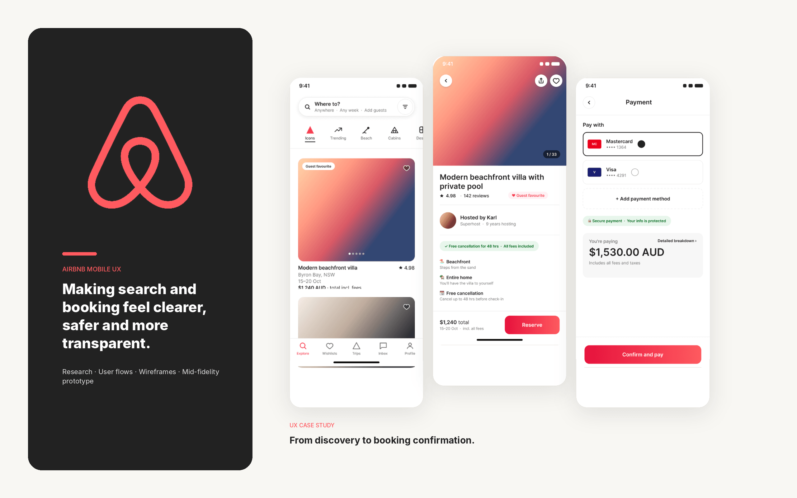
This project examined Airbnb's accommodation search and booking journey to identify where the experience could be streamlined and easier to navigate.
The study focused on six recurring issues: pricing transparency, map usability, filtering behaviour, the month-selection experience, cross-device consistency and decision fatigue. The proposed design responses were informed by an existing user-flow review, desk research and one user interview.
User flow analysis
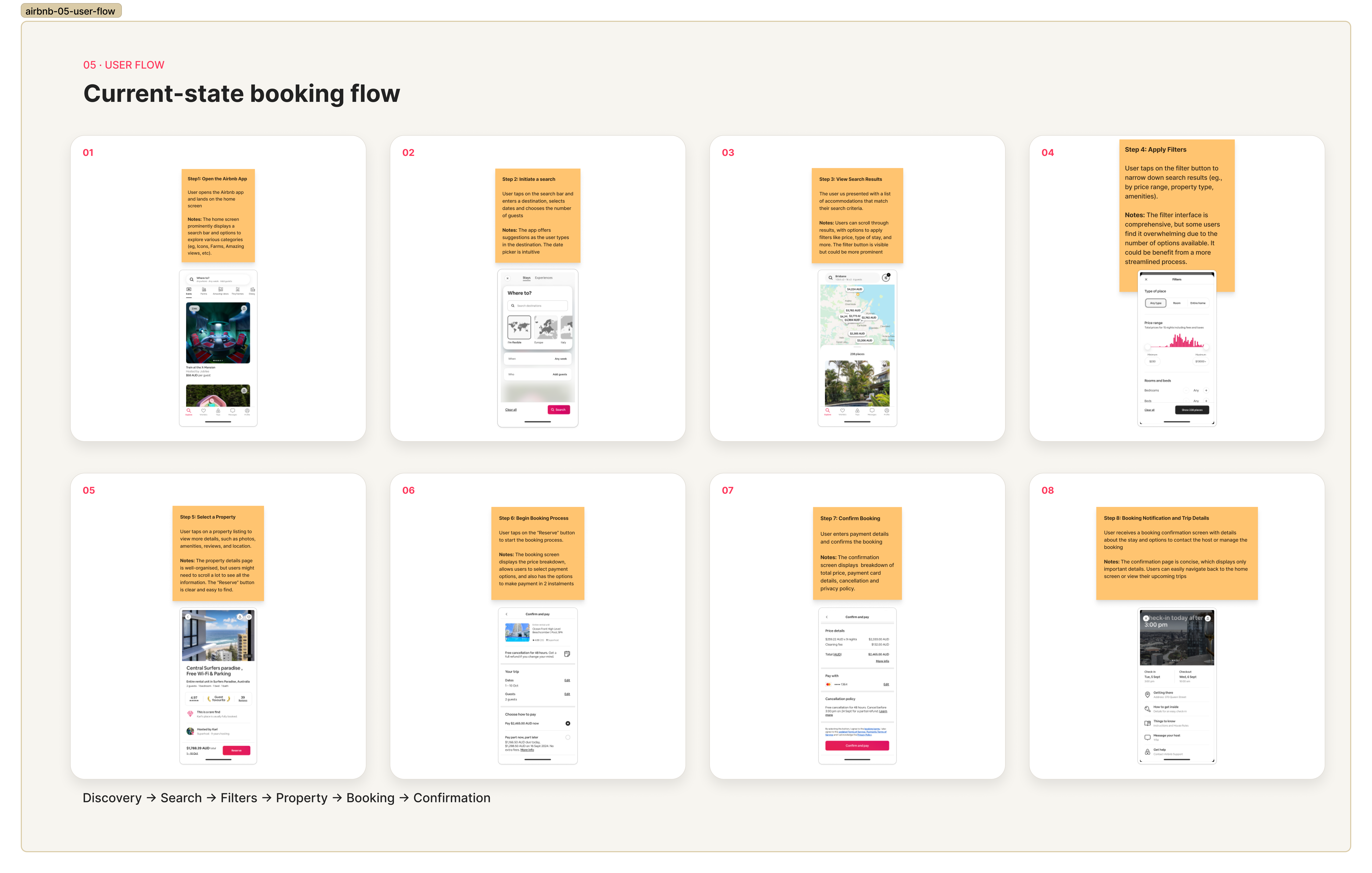
I documented the existing journey from entering a destination and selecting dates through to filtering results, browsing the map, reviewing a property and progressing towards a booking.
The initial search process was straightforward, but friction increased as users refined and compared their options. Map results could change or disappear after the view refreshed, filter behaviour was not always predictable, and the month selector made broader date exploration less efficient.
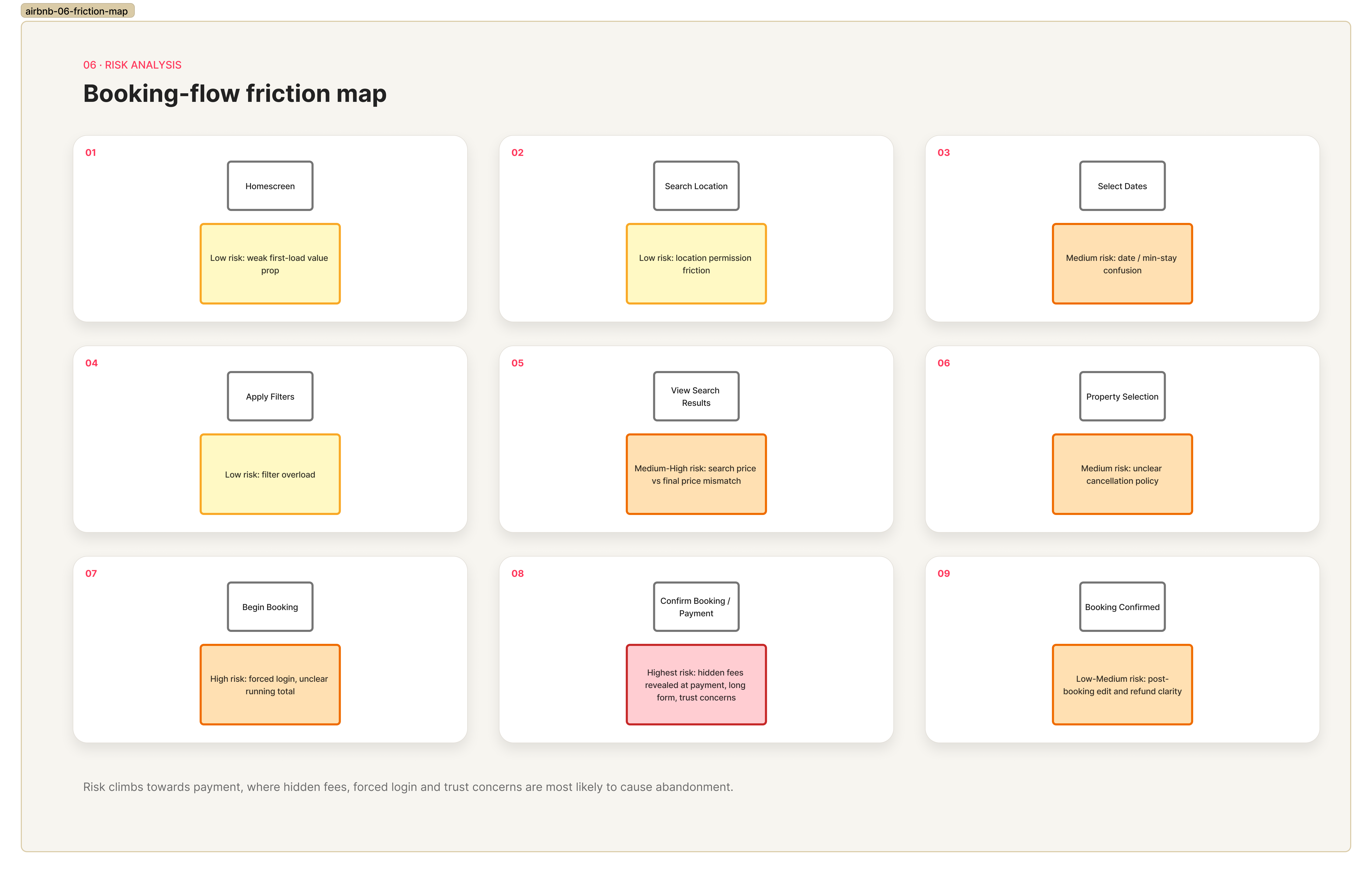
The total price was also not always clear early in the journey. Comparing similar properties required repeated navigation between listings, increasing the effort needed to make a decision.
Desk research and user interviews
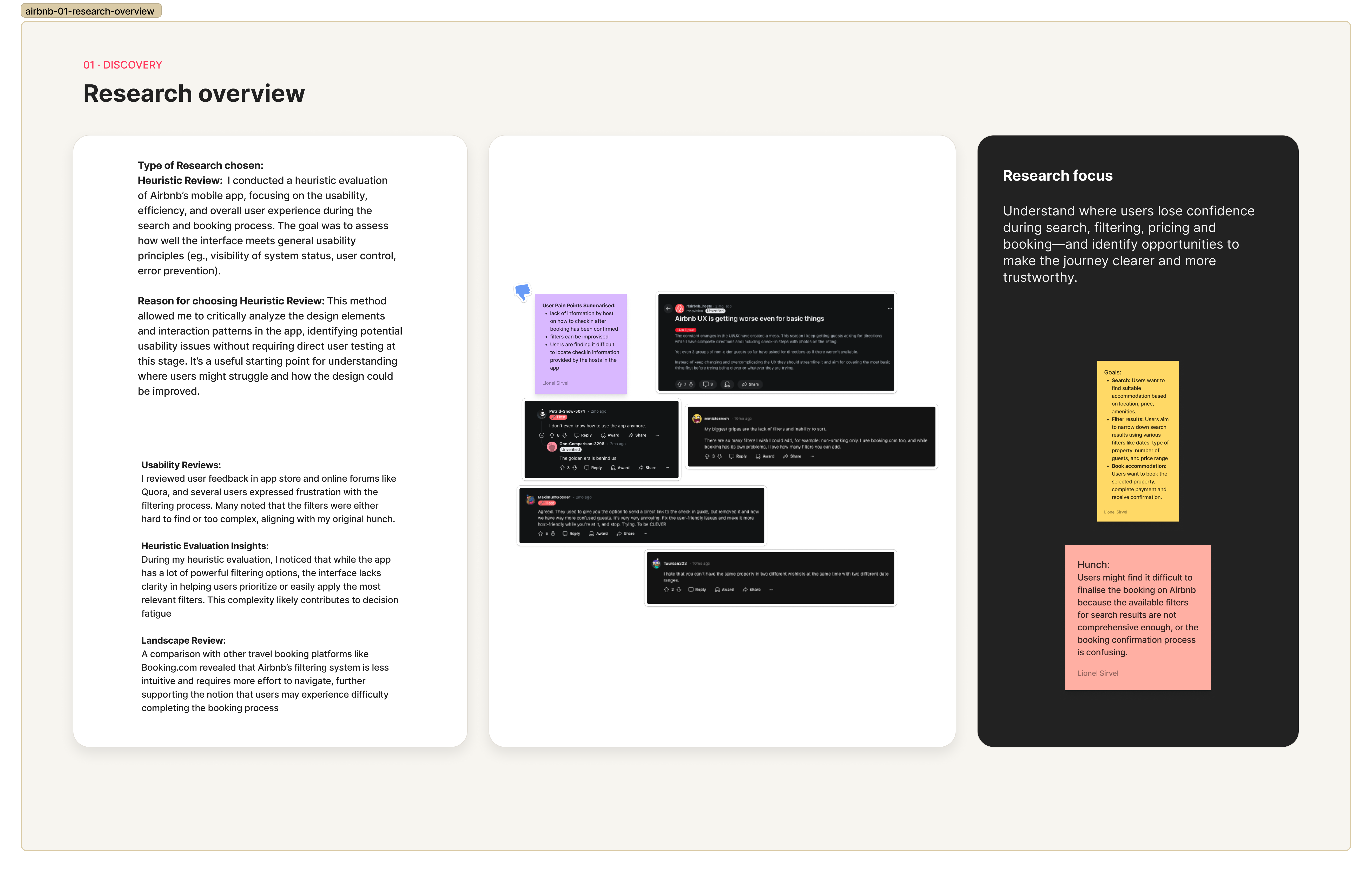
I conducted a heuristic review, reviewed user feedback and benchmarked Airbnb against other accommodation platforms. This research highlighted recurring concerns around additional fees, filter clarity, search-result consistency and the amount of information users needed to process before booking.
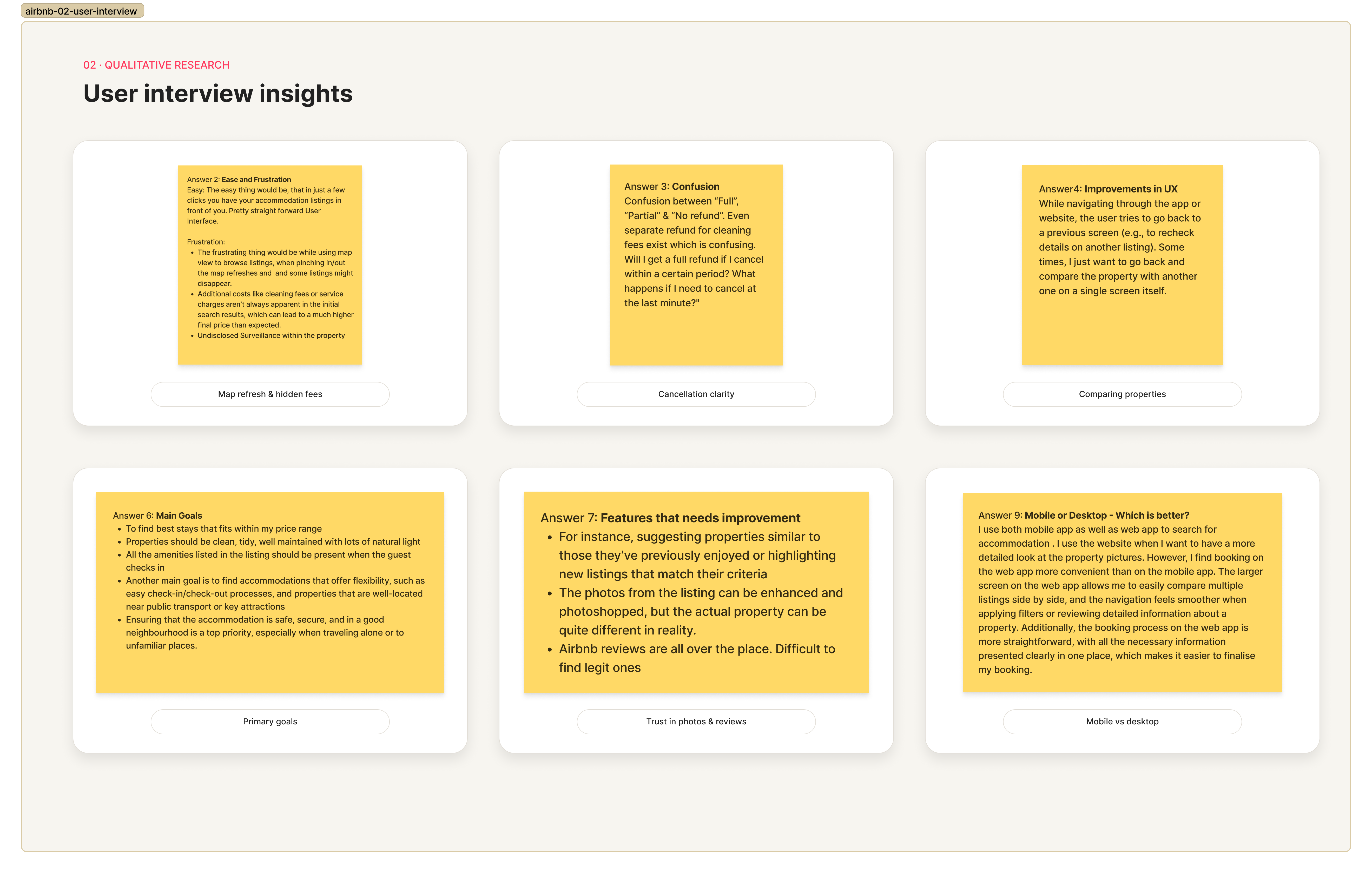
I also interviewed one frequent Airbnb user who mainly booked weekend trips, usually around one month in advance. The participant used both mobile and desktop but preferred desktop for viewing property images, comparing listings and completing bookings.
The interview supported the need for clearer pricing and easier property comparison. It also showed that the experience was not always consistent when the participant moved between devices.
Research synthesis
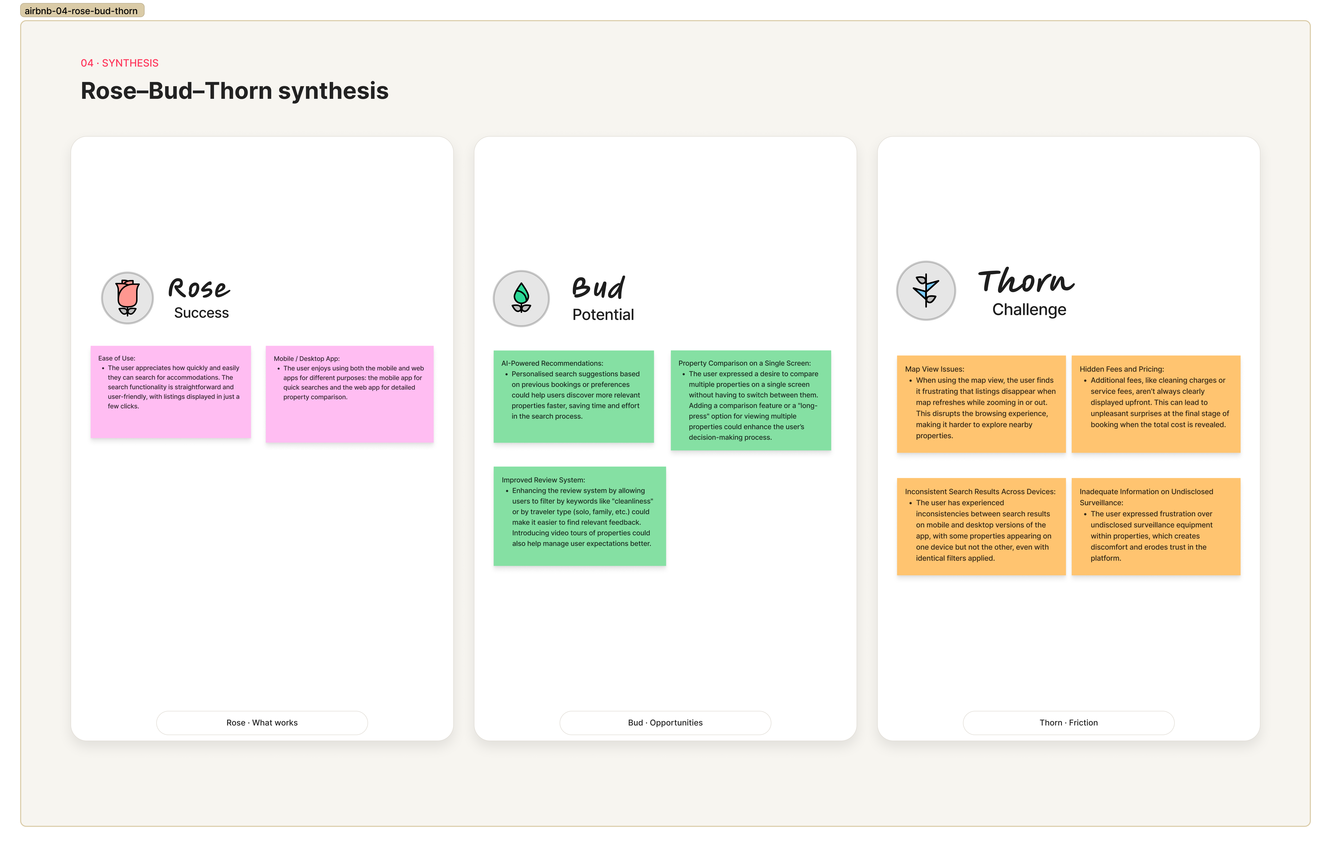
I organised the findings using affinity mapping and a Rose, Bud and Thorn exercise.
The positive findings showed that Airbnb's initial search experience was familiar and easy to begin. The main areas of friction were unexpected fees, unstable map behaviour, confusing filter interactions, limited visibility across different months and inconsistent search results between mobile and desktop.
These findings revealed a broader problem: users had access to many properties but limited support for narrowing their options and comparing them confidently.
The design direction therefore focused on improving clarity, continuity and decision support rather than redesigning the complete Airbnb experience.
Design hypotheses
I developed six hypotheses to connect the research findings with potential design responses:
- Showing the total price earlier could reduce uncertainty and help users assess affordability sooner.
- Preserving visible listings while users zoom or move the map could make location-based browsing more predictable.
- Clearer active-filter states and result feedback could help users understand how each selection affects the search.
- A more flexible month selector could make it easier to explore alternative dates and availability.
- Preserving search criteria and saved properties across devices could create a more continuous experience.
- Allowing users to review shortlisted properties together could reduce repeated navigation and decision fatigue.
These hypotheses guided the concepts explored during prototyping.
Low-fidelity prototype
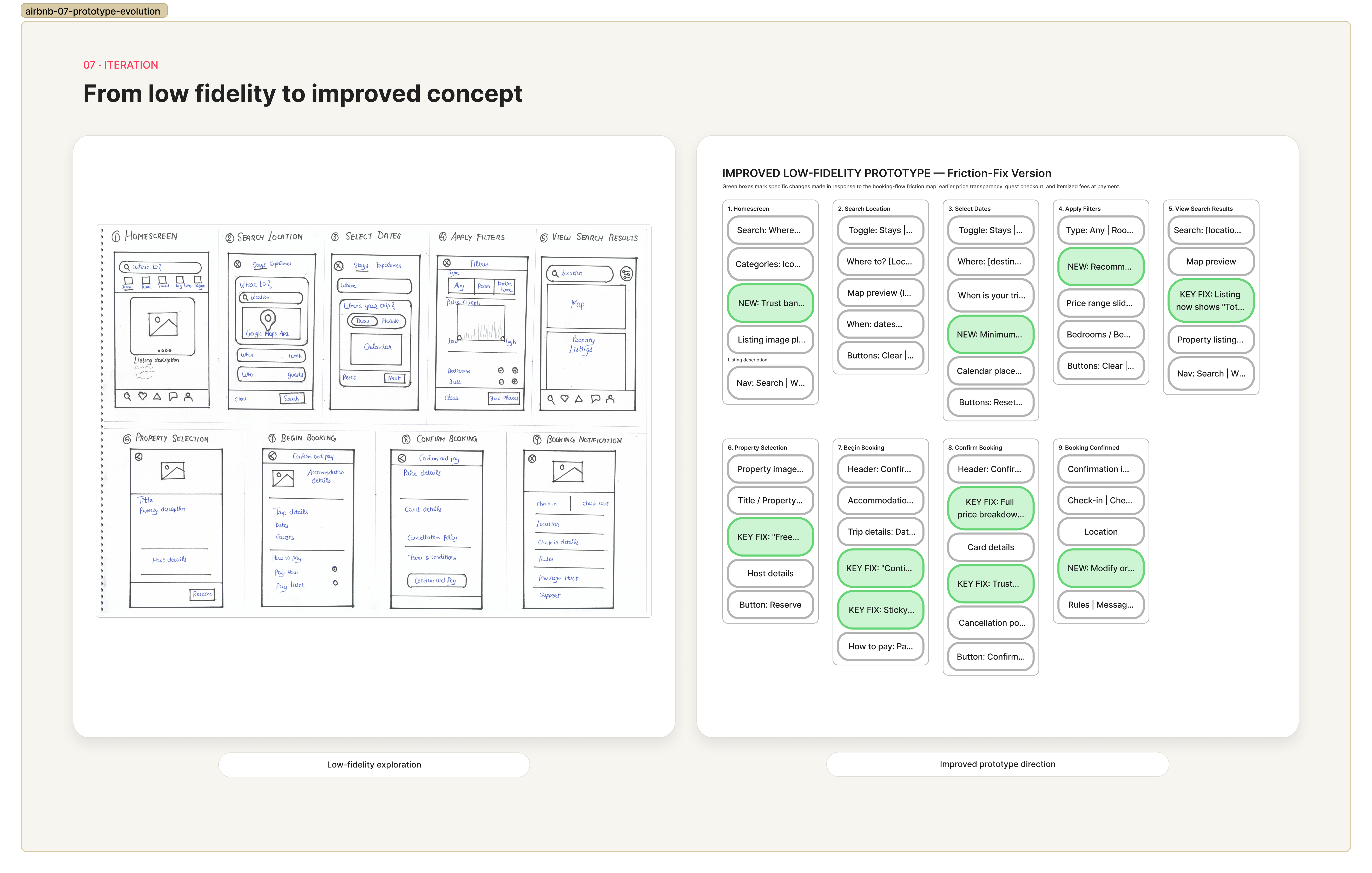
The low-fidelity stage focused on the areas of the journey that created the most friction while retaining Airbnb's familiar interaction patterns.
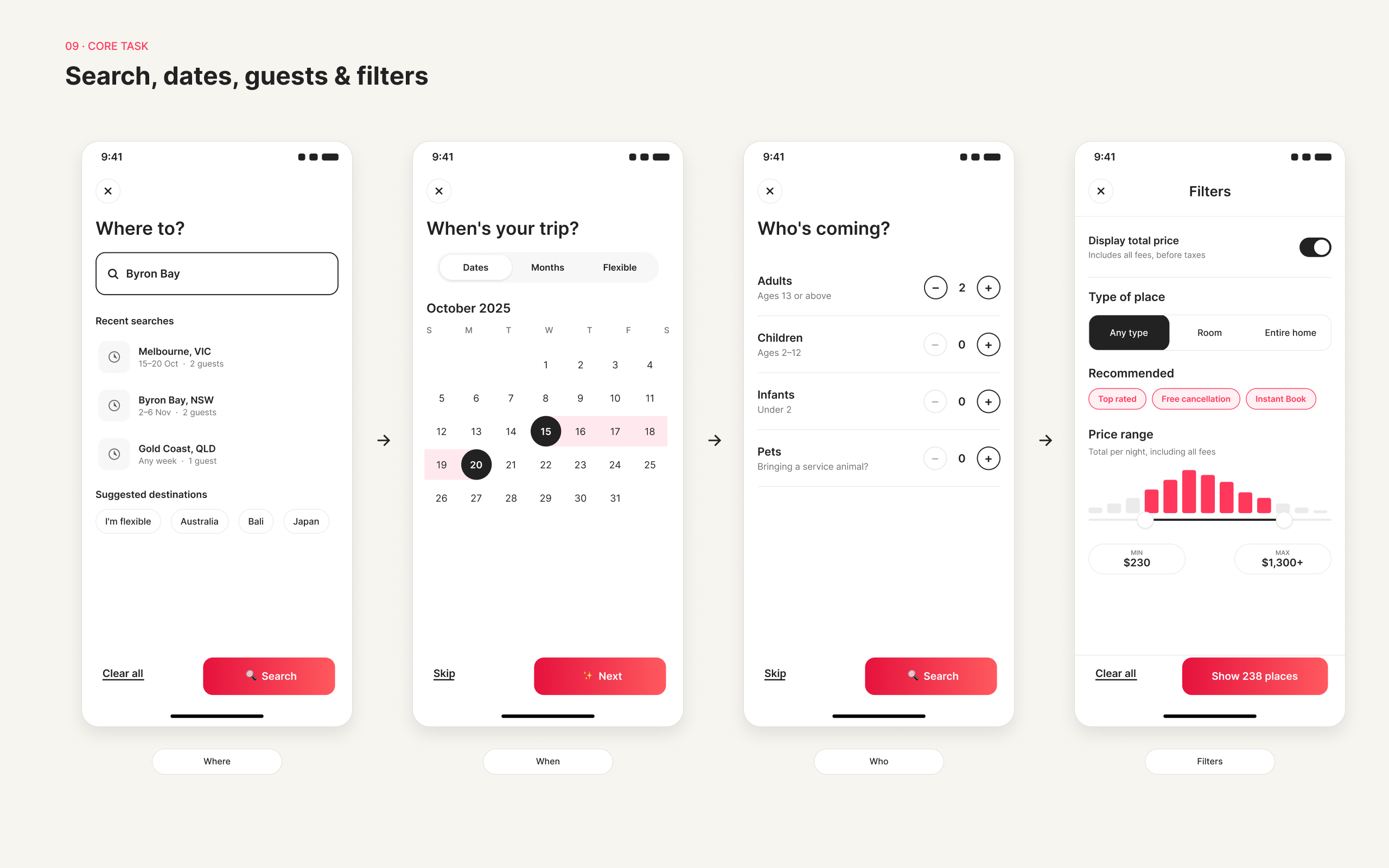
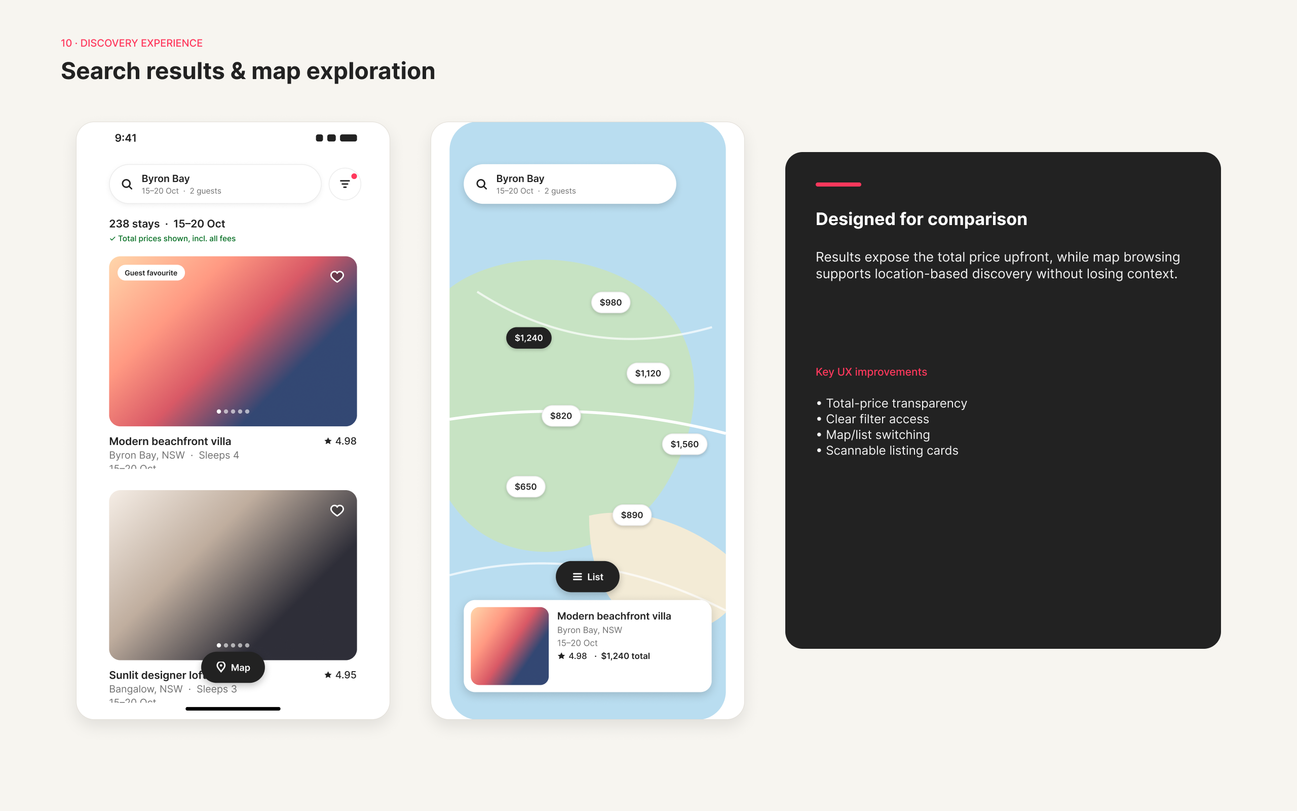
I explored revised search and date controls, a simplified month-selection flow, more visible active filters and a closer relationship between the map and listing results. I also considered how users could move between shortlisted properties more easily.
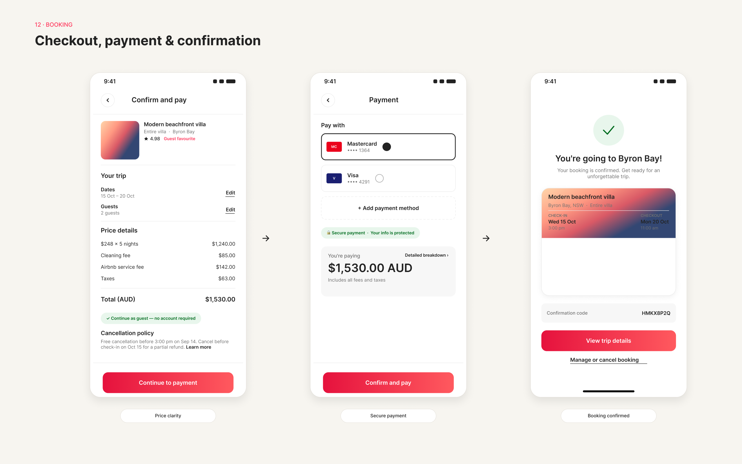
The wireframes explored where the total price and fee breakdown could appear so users could understand the likely cost before progressing further. This stage allowed me to compare different layouts and interactions before adding visual detail.
Medium-fidelity prototype
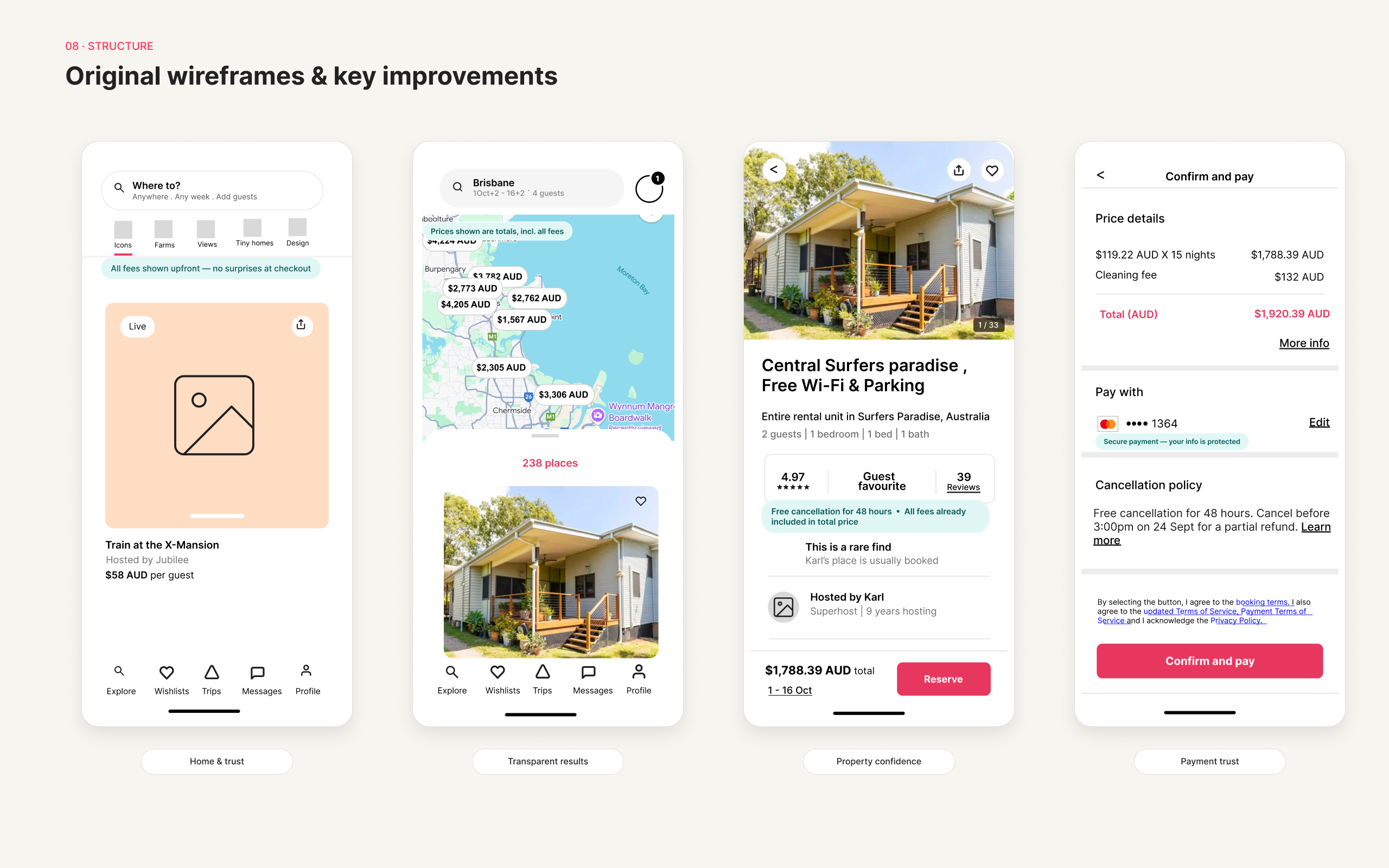
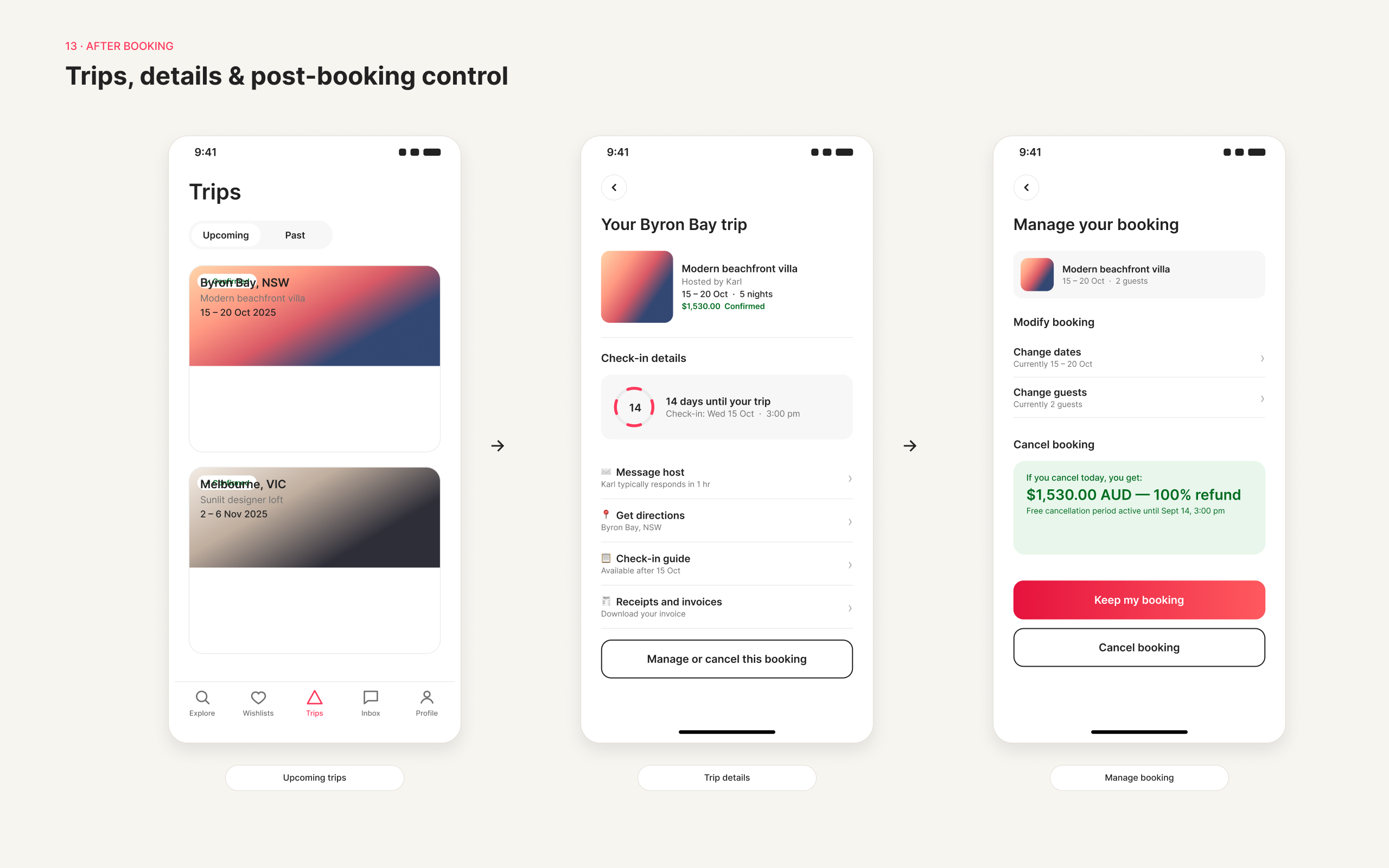
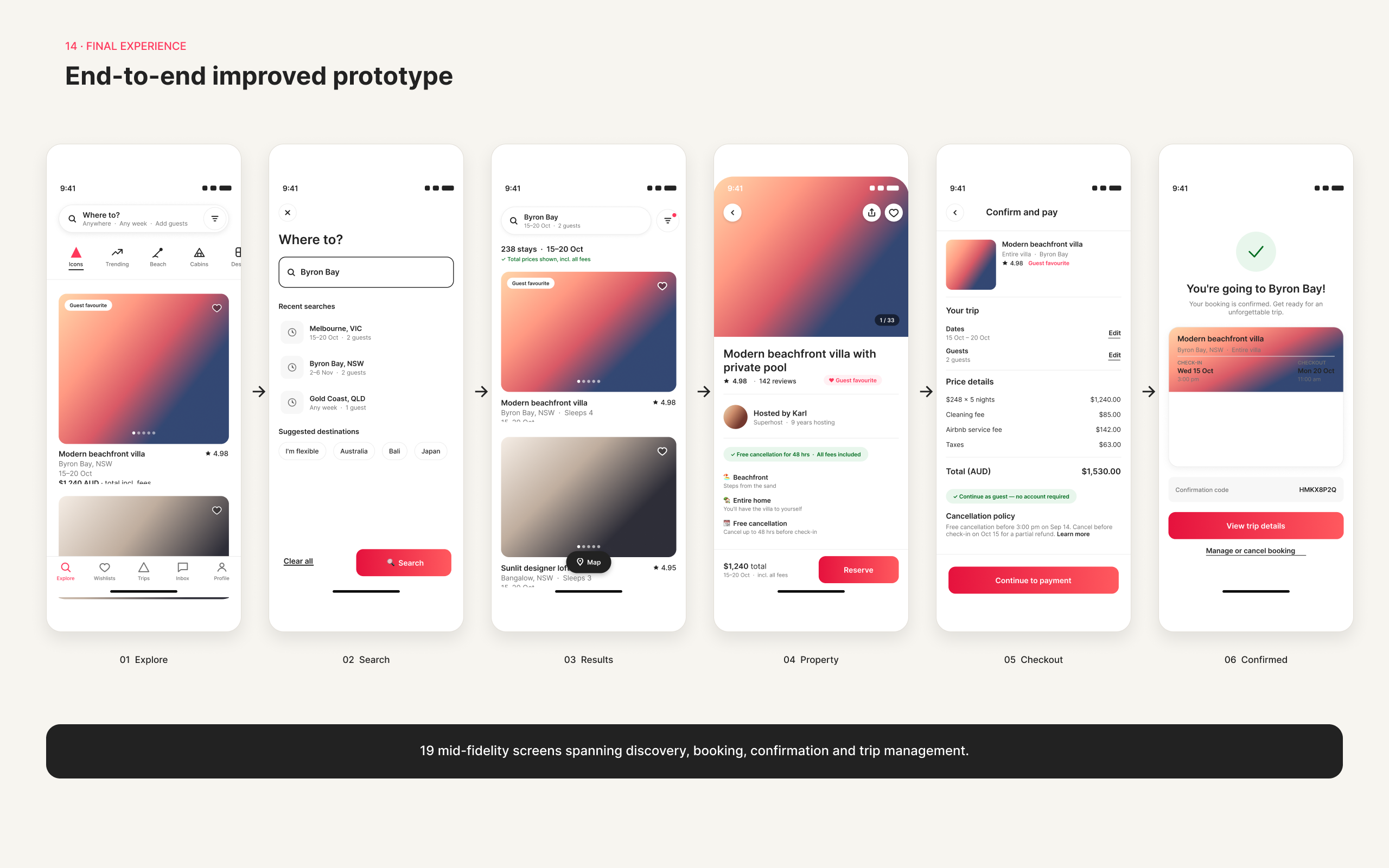
The medium-fidelity prototype developed the selected concepts into a more detailed mobile journey.
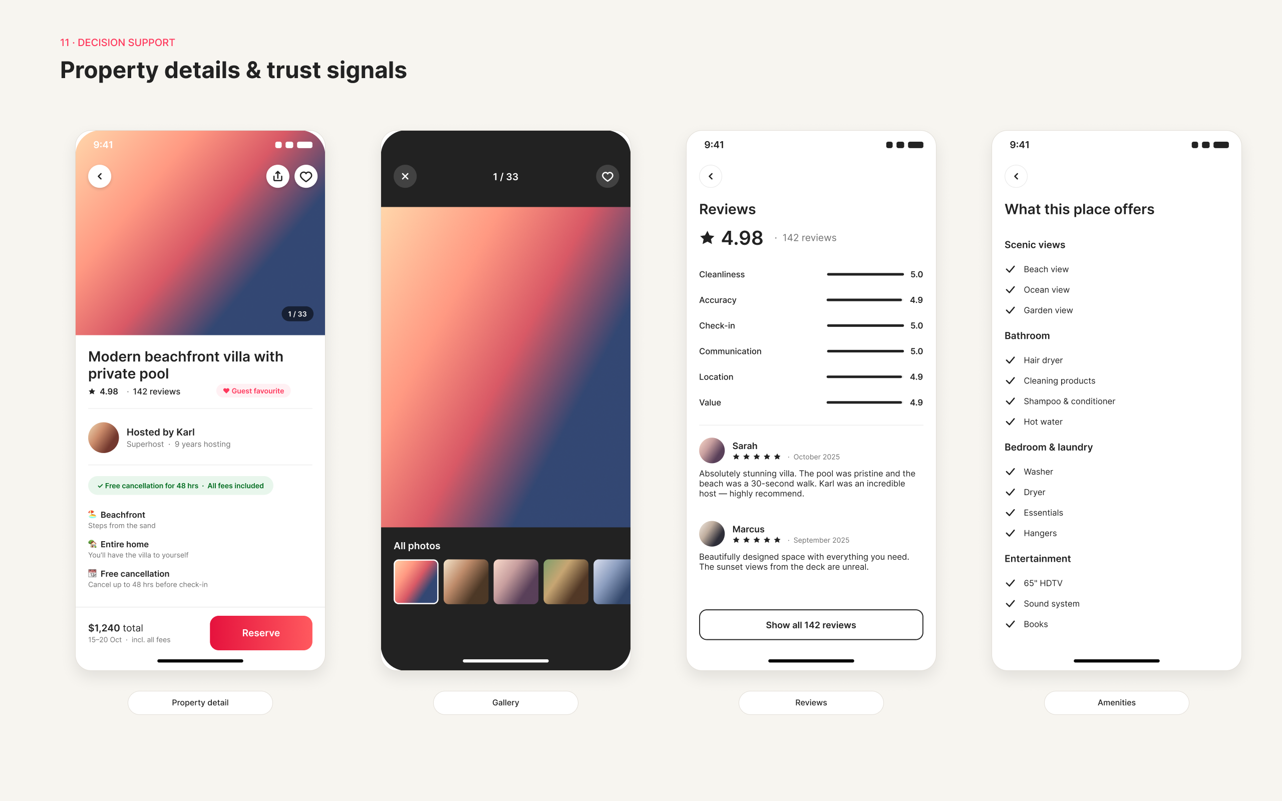
It proposed a clearer month selector, more visible filter states, a revised map-and-list interaction and earlier presentation of the total price. It also introduced a more structured way to review shortlisted properties.
The concept proposed preserving search criteria and saved selections when users moved between devices. The visual treatment remained aligned with Airbnb's existing interface so the changes felt like focused improvements rather than a complete redesign.
Outcome
This project strengthened my ability to move from an initial hunch to a focused problem definition, synthesise qualitative findings and connect each identified issue with a relevant design response.
It also reinforced the value of improving specific moments within an established experience. Rather than redesigning the entire product, I focused on targeted changes intended to make searching, comparing and assessing properties clearer and less demanding.
Project highlights
Switch the view, or open any image full-size.