UI Design & Design Systems
AirBorne UI Case Study
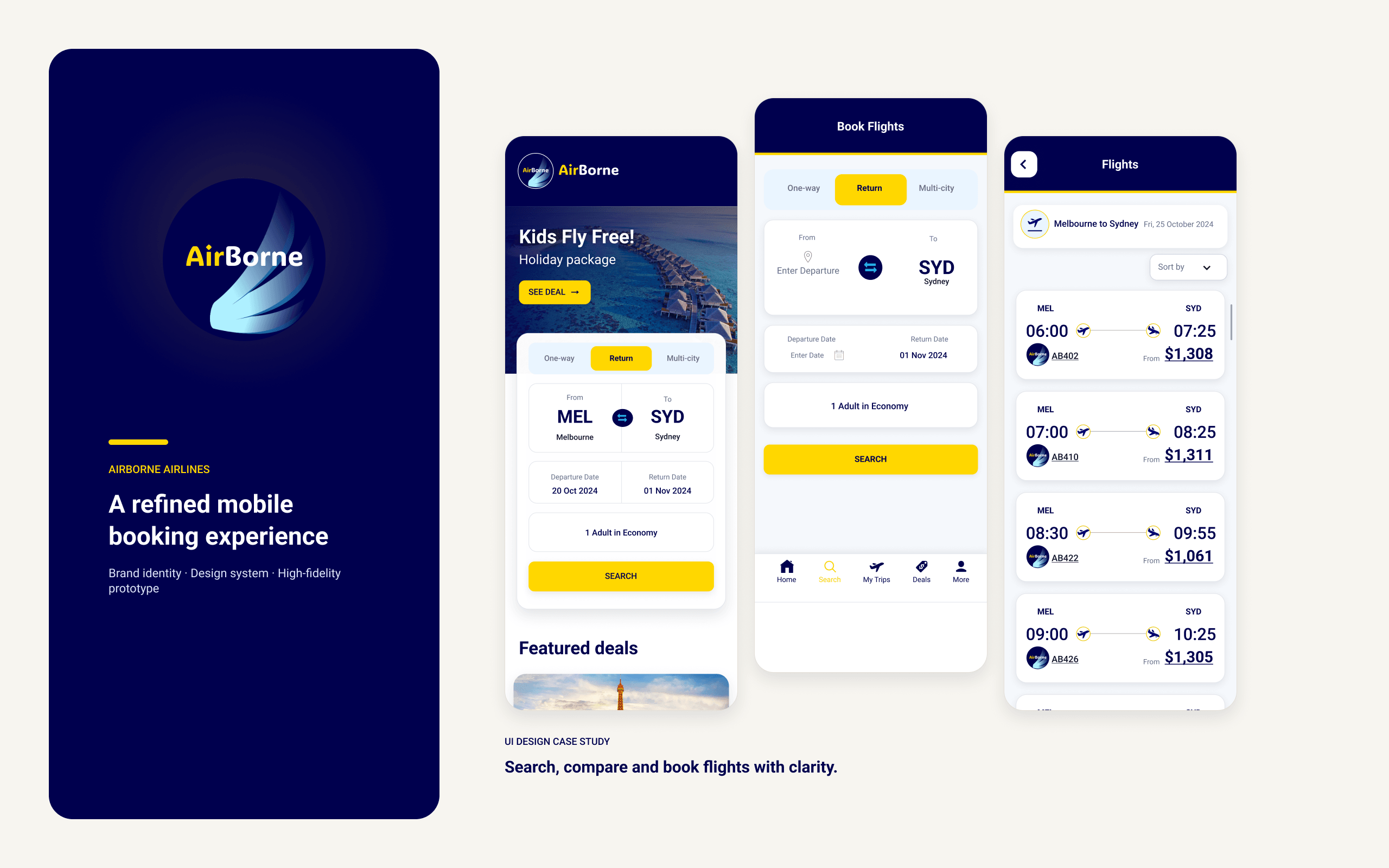
A cohesive design system, component library and high-fidelity mobile app prototype for AirBorne Airlines — from mood board to final clickable prototype.
- Role
- UI Designer
- Client
- RMIT UI case study
- Year
- 2024
- Tools
- Figma
Design challenge
AirBorne Airlines is a conceptual airline brand created for an RMIT UI design project. The brief required a responsive website that translated an existing, research-informed UX concept into a polished and consistent interface.
The design needed to communicate comfort, luxury and seamless travel while helping users search for flights, browse deals, understand the in-flight experience and access support. It also needed to address findings supplied in the brief, including unclear departure locations, missing deal expiry information and limited help page navigation.
Brand and visual direction
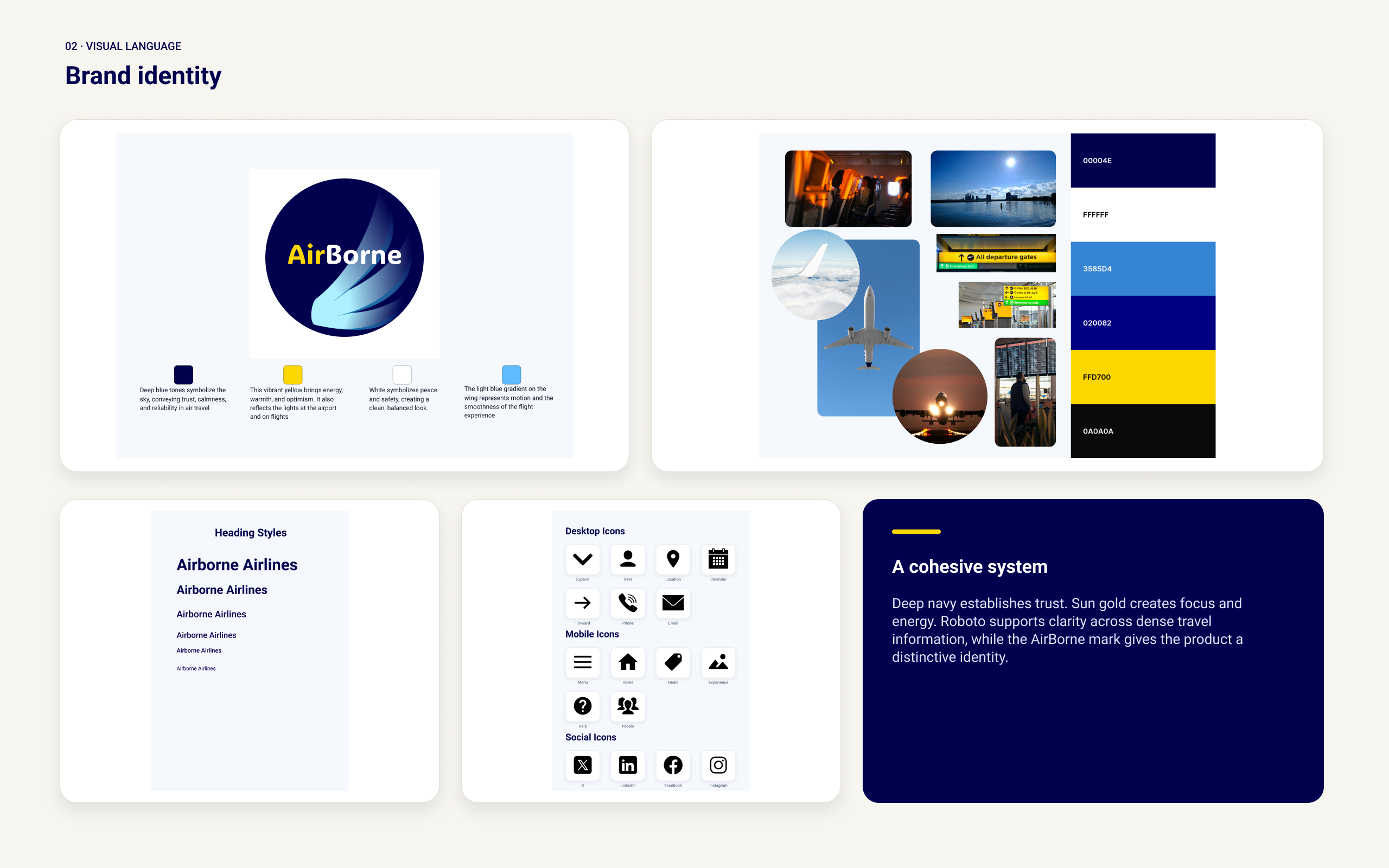
The visual direction centred on comfort, confidence and premium travel. Deep blue reflected the sky and supported a sense of trust, while lighter blues introduced calmness and openness. White created visual space, and gold-yellow provided contrast inspired by airport and aircraft lighting.
Typography was organised to support readability and hierarchy across headings, body content, labels, prices and supporting information. Spacious layouts, rounded interface elements, travel imagery and restrained accent colours formed a consistent visual language across the website.
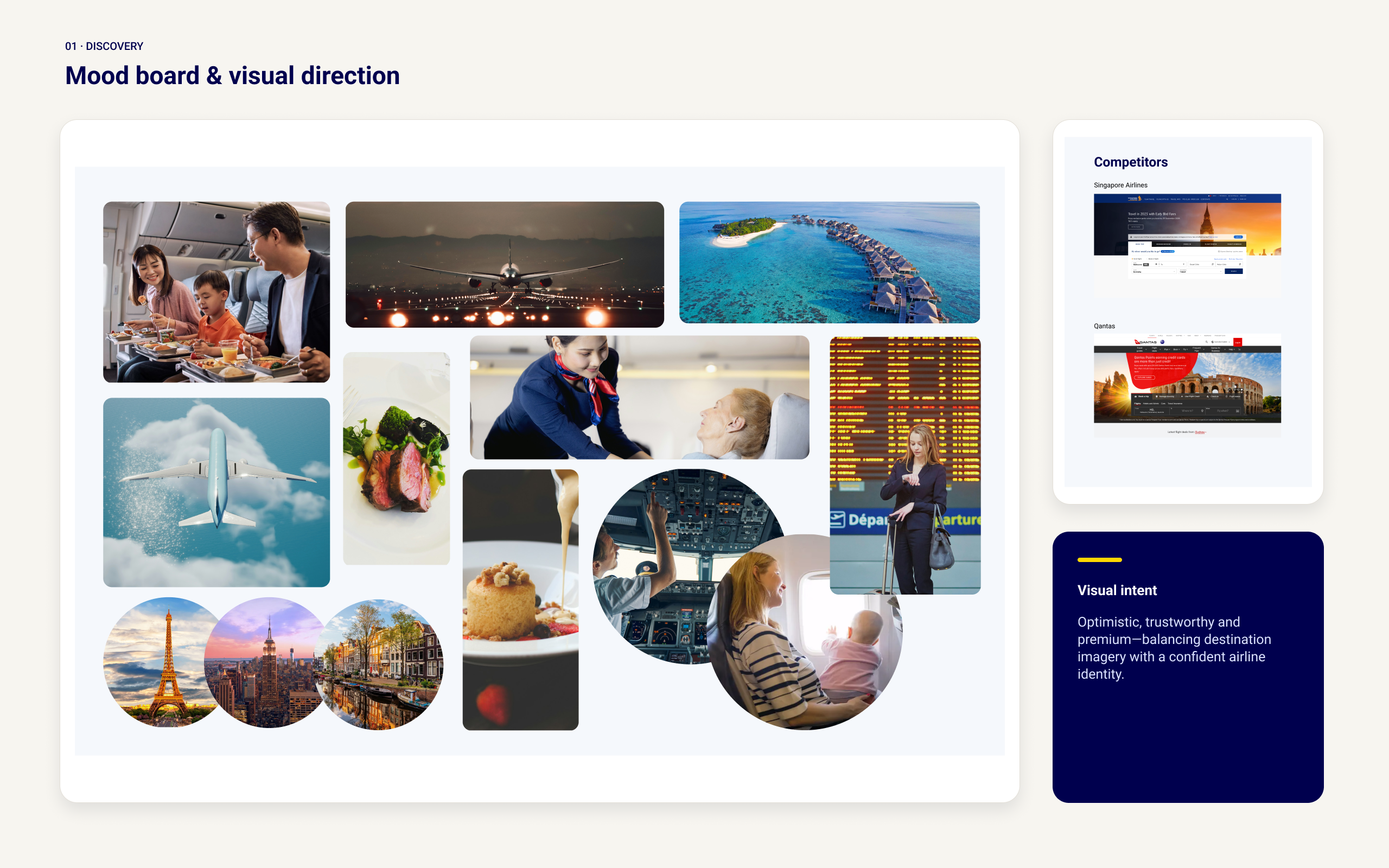
Moodboard
I created a moodboard to establish the visual direction before designing the interface. It combined the AirBorne logo, colour palette, typography, icon style and imagery related to destinations, aircraft interiors, hospitality and comfortable travel.
The moodboard became a reference point for later design decisions, helping the individual screens feel connected to the same brand rather than designed in isolation.
Design system
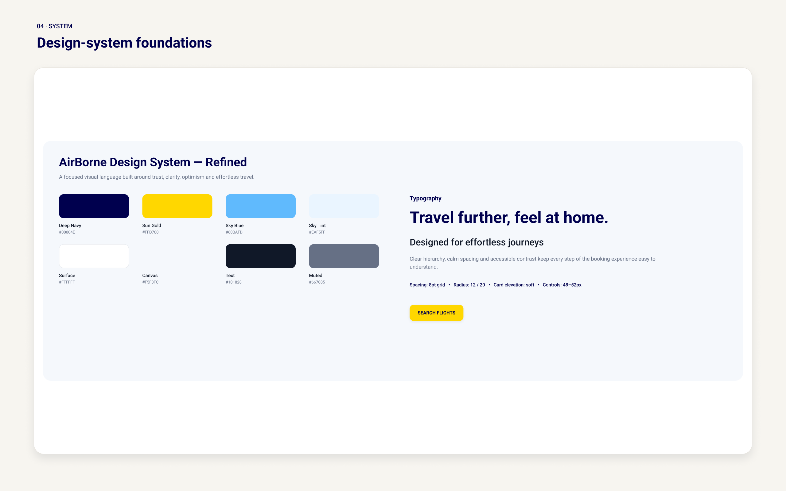
The design system established the visual rules used across the interface, including colour roles, typography hierarchy, spacing, corner radii and icon treatment.
Each colour was assigned a functional purpose. Dark blue supported navigation and high-priority content, lighter blue was used for supporting elements, and yellow highlighted important actions and promotional information. Neutral colours maintained contrast and readability.
The typography system defined consistent treatments for page titles, section headings, body copy, form labels, prices and secondary details. These foundations reduced unnecessary variation and provided a repeatable structure for designing new screens.
Component library
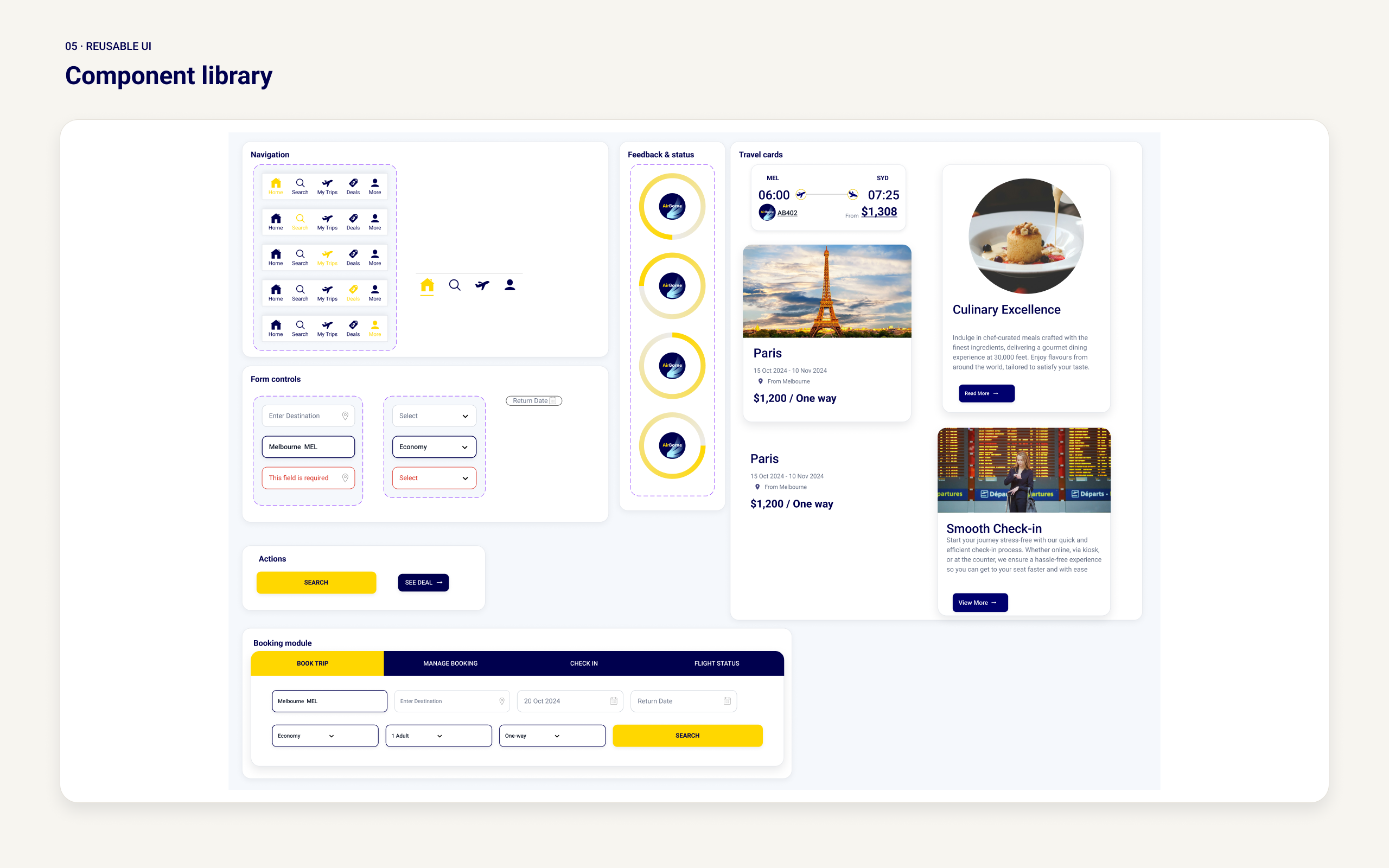
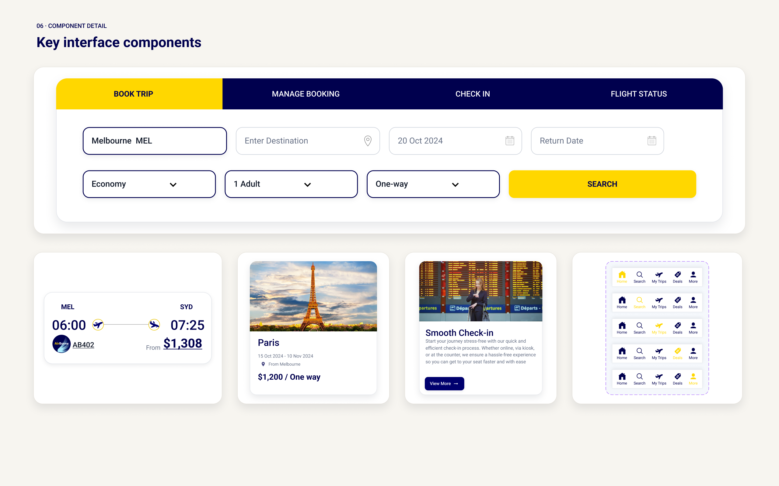
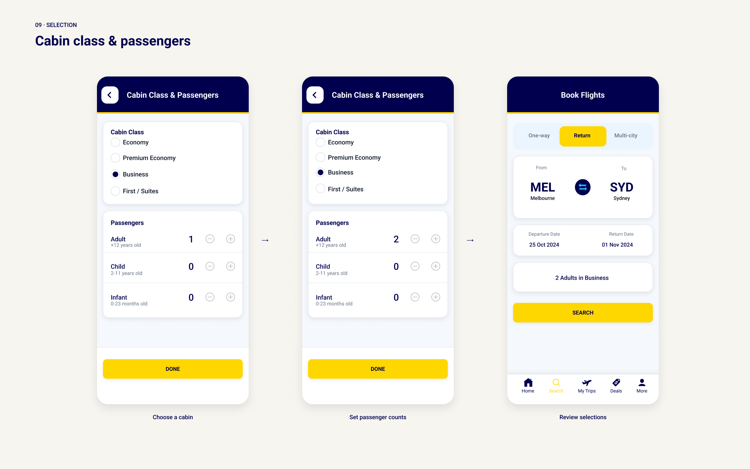
The component library translated the design-system foundations into reusable interface elements. It included navigation controls, buttons, search fields, date and passenger inputs, trip selection controls, deal cards, content cards, sorting controls, help categories and booking management fields.
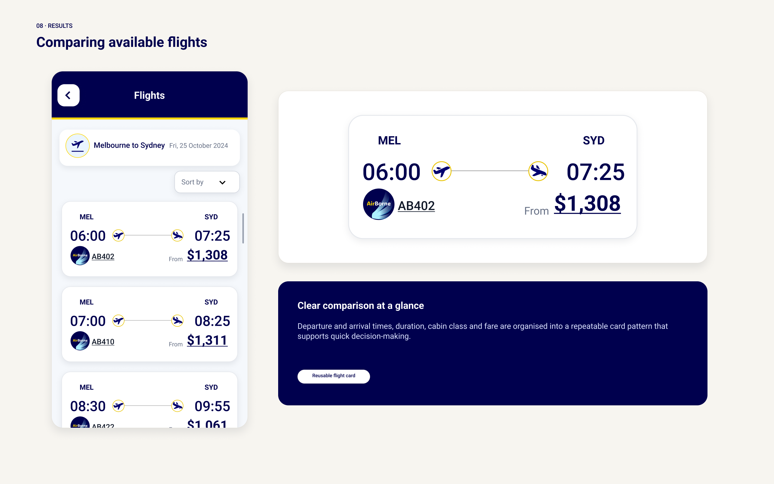
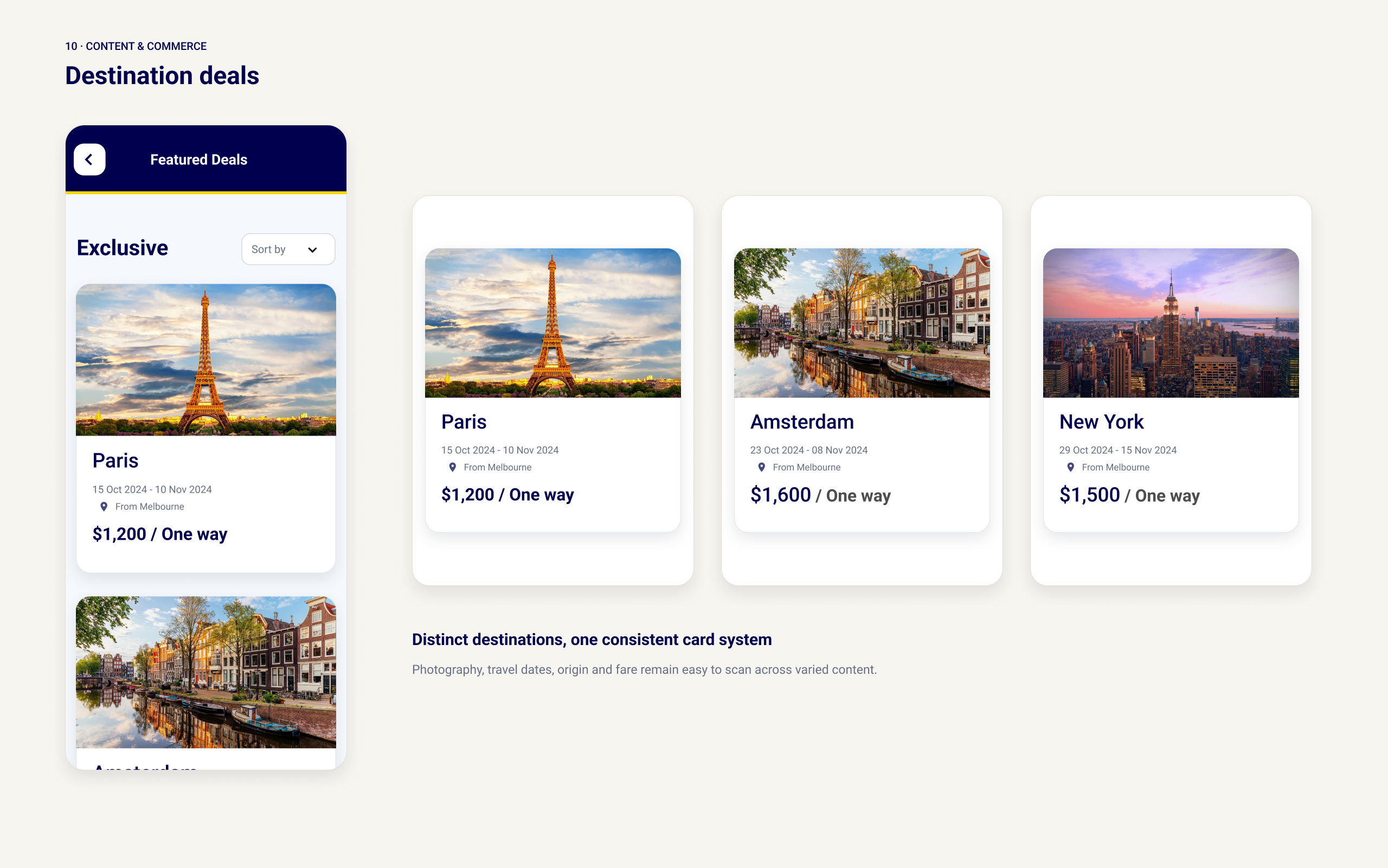
Components were designed as repeatable patterns rather than as elements tied to individual pages. Flight-deal cards, for example, used a consistent structure for imagery, departure and destination information, travel dates, prices and deal-expiry messaging. Form controls followed shared rules for labels, spacing, borders and feedback.
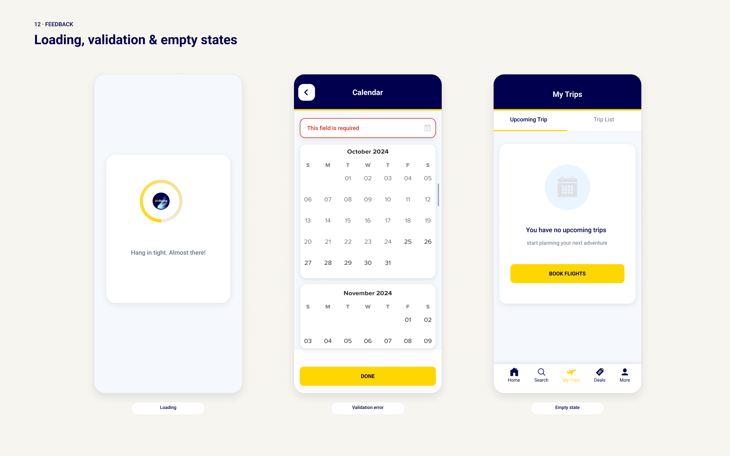
The system was also intended to account for relevant interaction and content states, including default, hover, selected, disabled, loading, empty and error states. This helped establish how components should communicate actions, incomplete information and problems without losing visual consistency.
Using shared components reduced repeated design decisions and helped maintain alignment across the booking experience.
Core booking screens and workflows
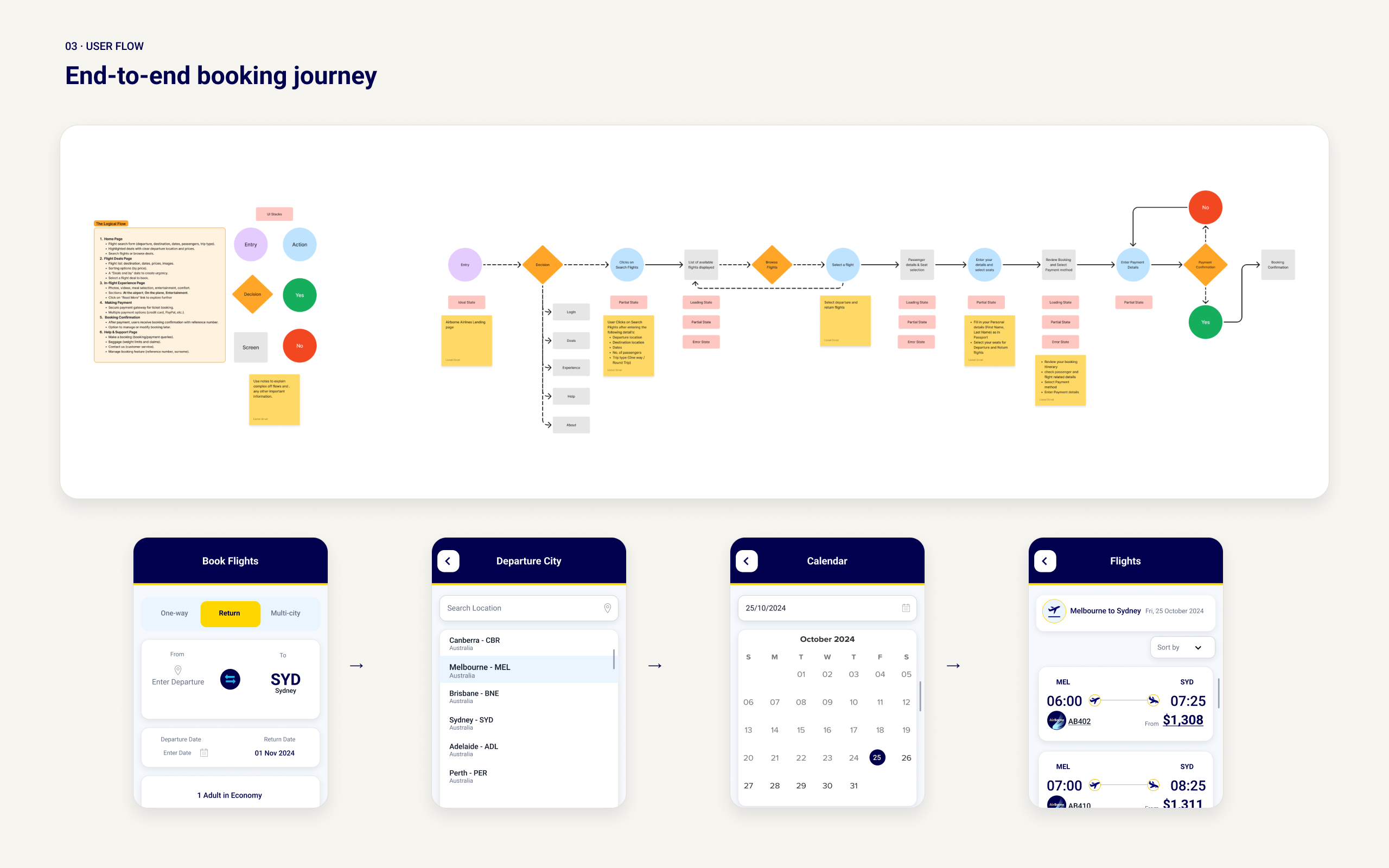
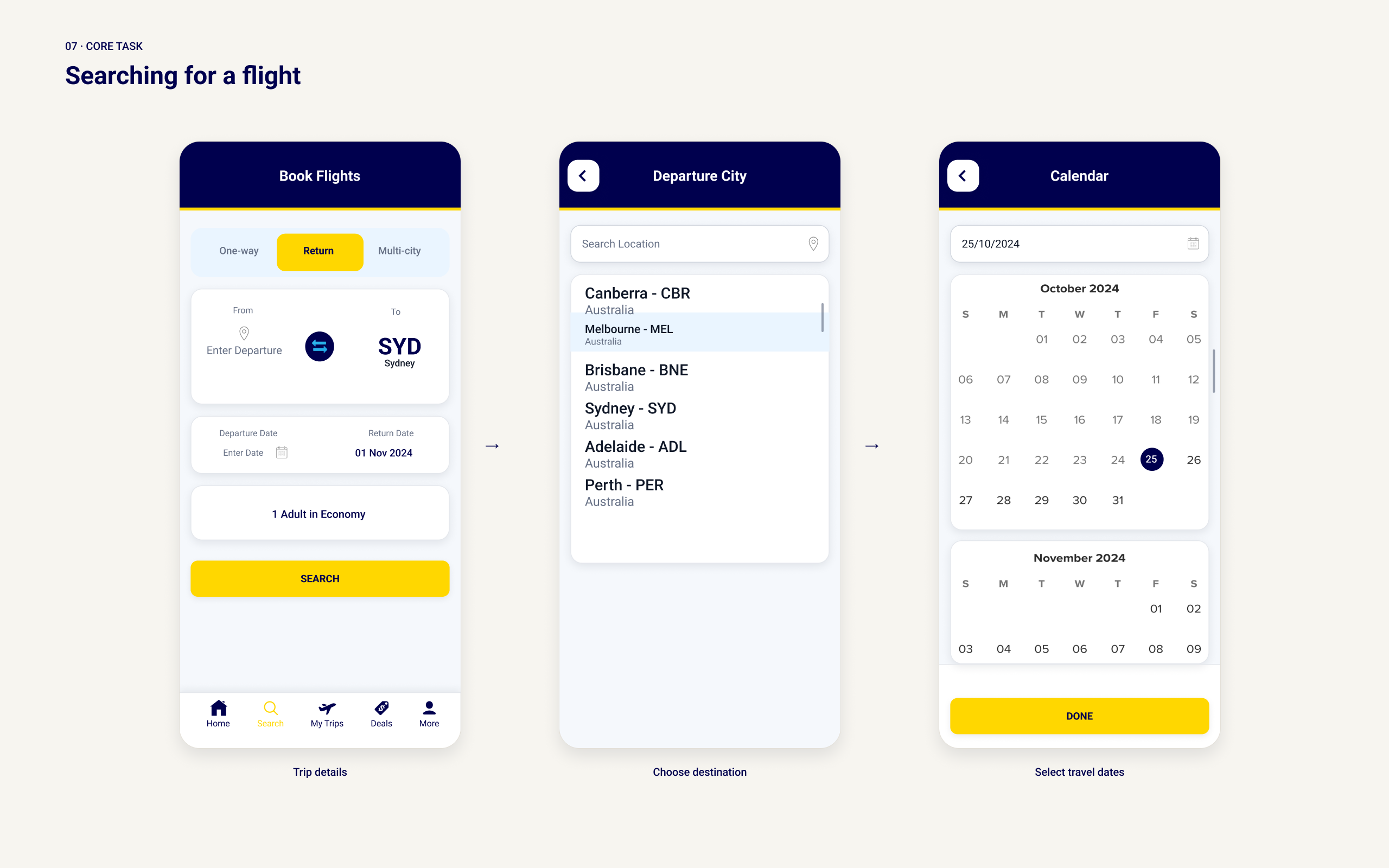
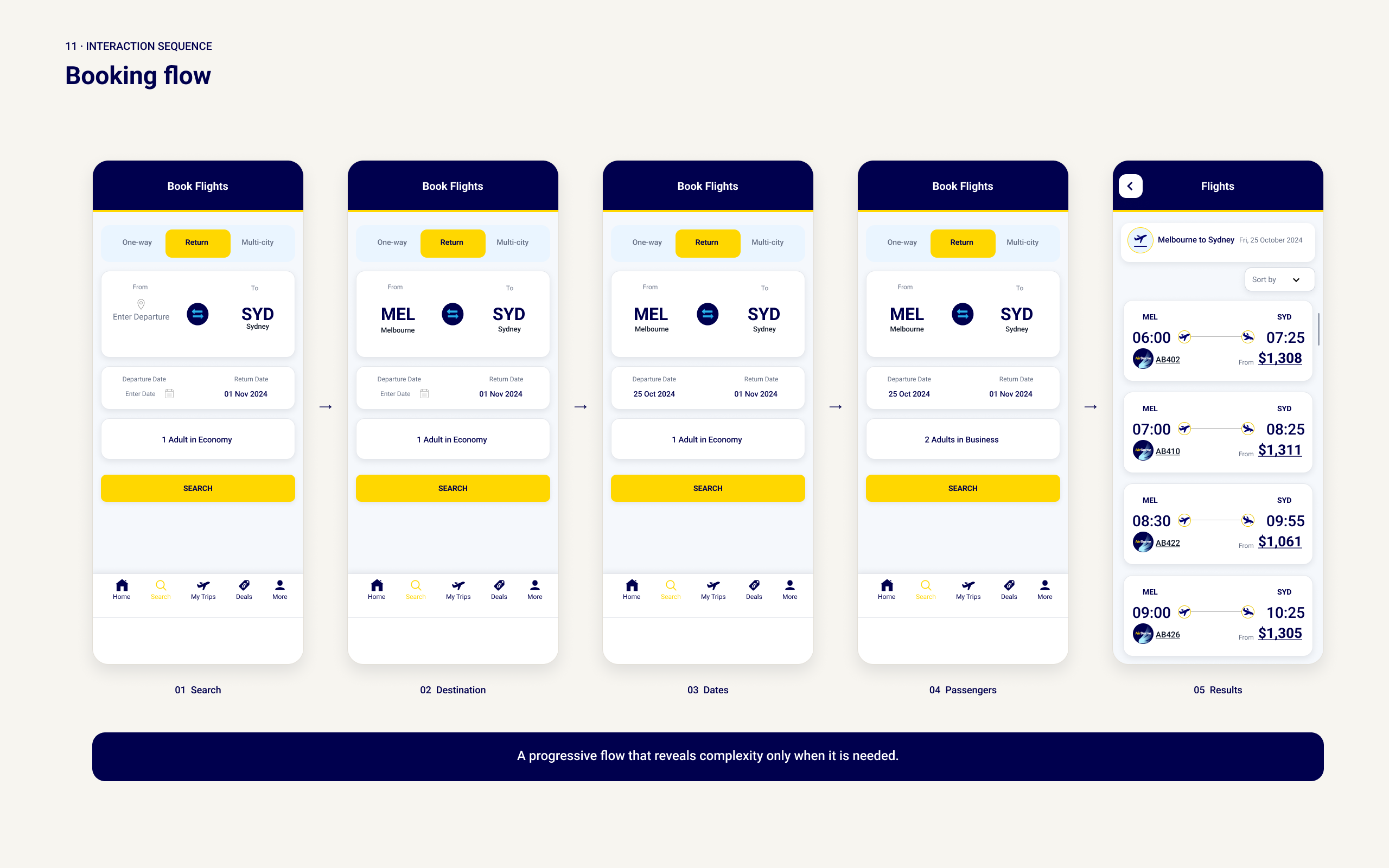
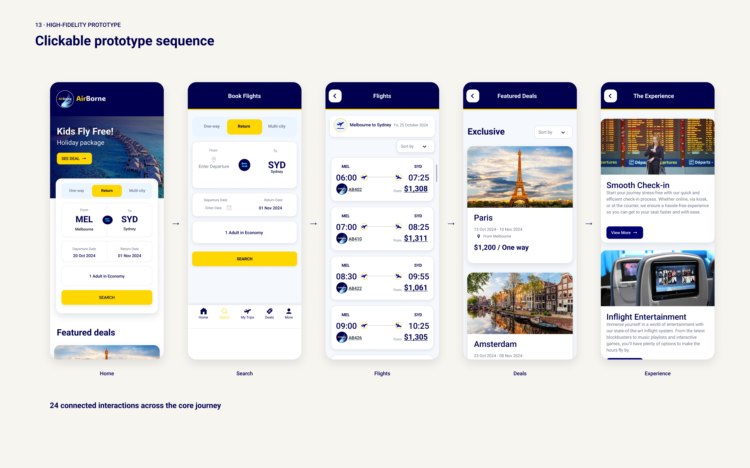
The core journey began on the landing page, where users could enter their departure location, destination, travel dates, passenger details and trip type. From there, the flow continued through flight search, deal browsing and flight selection, before progressing towards payment and booking confirmation.
Supporting pages expanded the experience beyond booking. The Deals page presented promotional flights, the Experience page introduced features such as extra legroom, onboard dining and customer service, and the Help page provided access to booking, baggage and contact information.
The workflow used consistent form patterns, flight information and calls to action to make movement between stages more predictable.
High-fidelity prototype
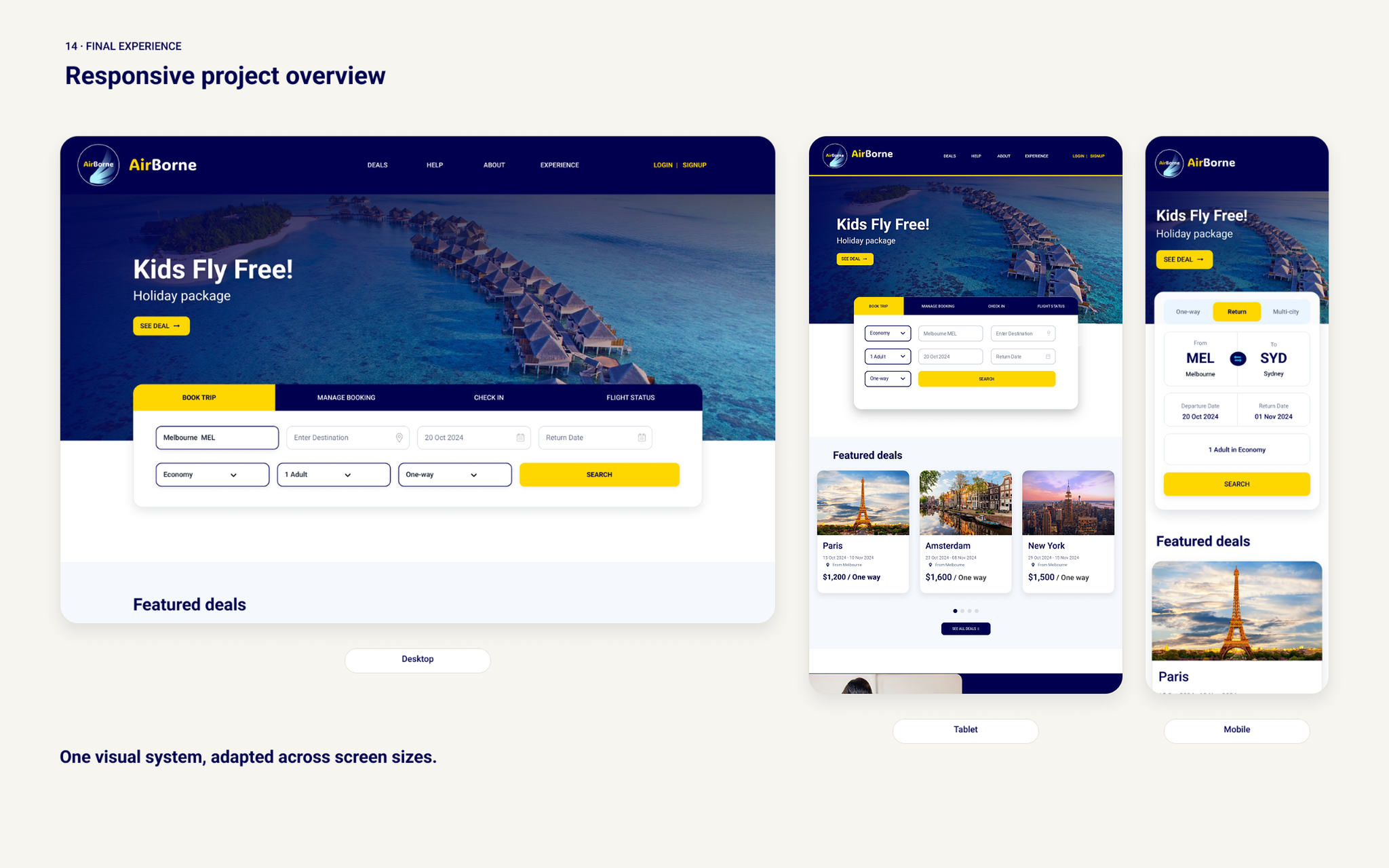
The high-fidelity prototype brought the brand direction, design system and reusable components together into a connected interface. Consistent spacing, typography, imagery and interaction patterns were applied across the desktop and mobile layouts.
The clickable prototype demonstrated navigation between the homepage, deals, experience and help pages. Responsive layouts adapted content for smaller screens through stacked form fields, simplified arrangements and mobile navigation.
User testing
The project brief included findings from an earlier round of user testing. Participants had difficulty noticing the departure location within promotional deals, wanted clearer information about when offers expired and expected to be able to search for specific help topics.
These findings indicated that essential information needed stronger visual emphasis and clearer navigation. They were used as inputs when developing and refining the UI.
Design iterations
I increased the prominence of departure locations within flight-deal cards so routes could be understood more quickly.
Deal expiry indicators were added to clarify how long an offer remained available. The Help page was also refined with a visible search function and clearer pathways to booking, baggage and contact information.
Navigation, spacing and component alignment were adjusted to strengthen consistency across the desktop and mobile layouts.
Final interface
The final interface combines a premium visual identity with a clear and approachable airline experience. Users can search for flights, browse promotional deals, explore the in-flight experience and access support through a consistent set of patterns.
Reusable components, responsive layouts and structured content hierarchy connect the different areas of the website. Flight information and deal conditions are given greater visual prominence, while navigation remains consistent across the main pages.
Outcome
The project progressed from moodboard exploration to design system foundations, a reusable component library and a high-fidelity clickable prototype.
The project reinforced the importance of designing an interface as a connected system rather than as a collection of separate screens. Establishing reusable components early supported greater consistency during iteration, while the testing findings demonstrated how hierarchy, labels and visual emphasis can affect the clarity of flight information and navigation.
Project highlights
Switch the view, or open any image full-size.